Hello all, I'm going to bore you with all this expounding on color that I'm about to do! There is a picture that I've done as a project for a watercolor group that I belong to. When I first did it, I hated it so much. It was not colorful, only having about 3 colors to it, and it was dead to me. I almost threw it out.
Then, last night, I got started on it, and it went where it wanted to go.
Now I find myself sort of defending it among my fellow groupies, but that's ok!
Here's what I wrote so far about this.
I had to work on this project a little more. I was way over there into it
tonight. Here's what I did. I took a little inspiration from Gina, and
from my daughter, who said, "Why are your backgrounds so dark?"
And my granddaughter who said "Why don't you ever put some colors back there?"
But more than that, it took on it's own look. I did not look at the photo again.
That's something I often do, when I get to a certain point, I put away the photo,
then let the painting be what it wants to be.
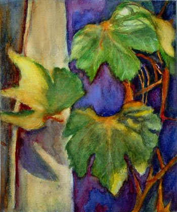
Here it is. I could have taken a better picture outside in the sun, but that was
not available to me tonight! I'm going to take another pic tomorrow if the sun shines.
(Then somebody wrote they thought it was overworked.) My reply:
Artmaker wrote: Well, if you saw it in real life I think you would like it. This photo does nothing for
it having been taken inside way after dark! Anyway, I felt very uneasy with it.
But after I worked on it, I began to like it. The leaves came toward me, the blue
receded, I was able to make some highlights where the sun hits the leaves, (Although I'm
still not satisfied with that) and toned down the light value on that post, Cheryl said it
was a post because she has seen lots of grapevines and they put them there as a
support for the vines. I did that to make the highlights on the leaves show up better.
There is actually some depth in this one, whereas the dark background (which was
hard to get rid of) was flat to me and dead. So that was my rationale,
and now I like it very much! So there's no accounting for taste, right? I will try to
get a picture outdoors so you can see the thing right.
Cia
and more:
p.s. I think that I have this wierd vision problem when it comes to my paintings,
where I want to see something, and I have to get that out of it or I'm unhappy and
uncomfortable. It's something about the relationship of colors. I love to see
violet, blue and yellow and gold and green in a painting, for some reason, no painting
seems right without that. There was almost a monotone about the first version,
and it was making me feel sick, does that make any sense to y'all? And there must
be some touches of orange in there too. After I lifted out that awful dark background
and put in some cobalt and some permanent magenta and let it run together, I felt
better, the stone on my heart began to lift. Then I began to approach my visual joy.
I began to see that relationship that my heart longs for. I know, I know, I'm getting
wierd on y'all. So I'm sad that nobody likes it but me and my daughter.
Cia
In response to that person who didn't like the changes I wrote additionally,
Oh I didn't! I knew in my heart and soul that it was my vision! I was a little bit
disappointed because you didn't see it too, but you know, to each his own vision!
Ha Ha...
There is more to my lengthy prose about this topic. I majored in music in college,
I wanted to be a choir director. So I took two years of music theory, (forgot it all
but still retain the feelings) and you know how you feel when a chord is unresolved?
Well, then when it resolves on the next chord, you feel satisfied, less uneasy, complete.
That's how I define the way I feel when I get the right balance, the right harmony,
etc. I don't really care about what other people think that much when it comes to that;
now if somebody says, your composition is off, your drawing sucks, your values are not
right, you don't have your light source clearly defined (and that is something I've been guilty of,
as well as the other things) then I will take another look and go right in and try to do something about that. But when
it comes to colors, I have my vision, and it has to be there, or I'm very, very unhappy.
Some people say something about the edges. Now I may need to think about that, because
I don't see any problem with those, I'm not looking at that as much as I am color, and depth.
I want the subject to come forward, the background to recede, and the values to be correct.
Perhaps in some future lifetime I will worry about edges. LOL
However, I still feel there is something else that this painting needs. I have to figure it out though,
if I don't, then I will call this a lesson well learned, and leave it at that. At least I feel like I
rescued this one out of the trash can! Ha Ha...
Cia


.JPG)


2 comments:
I think I can help with this painting. First: IT IS LOVELY, but what you are feel ing about it may come from the fact that, while the mauve/blues should recede, they don't. Well at least some of them don't. The reason for that is that the touch of red (alizarin I believe) that is in the mauve is warming it up and sending it forward. I am speaking specifically about the area between the leaves that looks like a gold-fish and the area above the leaves. The warm mauve in these areas is warmer by far than the green of the leaves and pushes forward and competes for attention. Since there is not focal point in the painting, the fish-shape becomes a dominant one.
Take a look at it again. Squint and you will see that the other mauve/blue areas recede, while the two I mentioned spring forward with their magnificent and complex colors.
Just my two cents!
Zan
I like this painting very much, but something is bugging me about it. My eye constantly goes to the blue background area in the middle of the painting as a COI. If i cover it on the monitor with my finger I find that lower leaf is a bit dull. I hope this helps, anyway it's a great painting.
Post a Comment