skip to main |
skip to sidebar
Visit a page I created for my florals. Hope you enjoy it!Cia
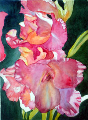
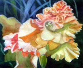 Hi Y'all, this is a painting I've just finished in the last day or so. This one took more time. It's called, simply "Yellow Glads".
Cia
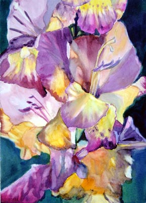
 Today I'm posting another gladiola picture. This one is a WIP (Work in Progress) and I know some things I want to do to it. I liked this one because of the backlit thing, as usual, and it does seem to glow! I think that I have a new motto: If it doesn't glow, it doesn't show. Cia
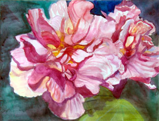
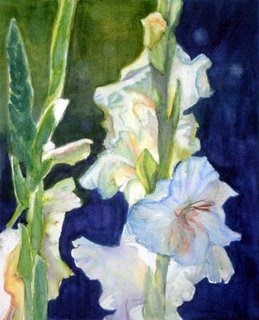 I painted this yesterday. I really like this one, I think I achieved the goal I had of getting these glads to "glow" because of being backlit. I find that backlit lighting is my favorite sometimes. I might do a little more to this but doubt it.
You could say that I'm on a "glad" kick right now. I'm already planning the next one!
This painting is 11 x 15 inches on Arches 140 lb cp paper. I used some watercolor pencils a little bit in some places.
It's called "Backlit White Glads"
 Seems I have found a new flower to paint! This gladiola seemed to say "paint me!"
So I did. I think it needs some finesse, but here it is.
 Well, here we are at almost the end of November. I don't know whether I'm coming or going!
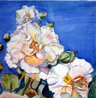
I will show you the latest things I've done though. This was my first attempt at painting on 140 lb. Arches hot press paper. I like how vivid the colors are!
This is the one before that.
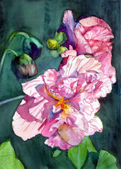
This one was done on 140 lb. cold press Arches. Both of these are from pictures I took of my Confederate Rose blossoms recently.
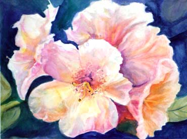
 Hello all, I'm pretty excited right now! Two of my paintings made it into the Manresa Animal Shelter Calendar. This one: On the site, it's called Rebel Rose instead of Confederate Rose to shorten the name for reasons of the way the site is done. This one is in a collage on the cover of the calendar.
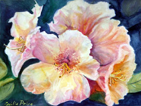
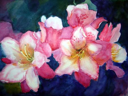
The second one is this one: Luminous Rhodies. It might be shortened to just Rhodies. I want to get these on some postage stamps, for one!
 Please visit Cafe Press/Manresa and if you purchase anything, the proceeds will go to the Manresa Benefit Shelter in Spain. I heard that they need a new roof!Please help this wonderful place continue to operate!Manresa Animal ShelterThere are many items, such as stamps, calendars, T-shirts, baby items, note cards and other things with these images on them.Thanks in advance for your assistance! Please let me know if you decided to do this so that I may thank you on their behalf.
 This is what I did yesterday and day before. It progressed from a wider picture. After Pauline Healey said the design wasn't good, I began to progressively tape off parts of the painting until I got to this place. I thought this was a good design. The main flower is not in the center and I left the space on the right for a resting space. Here I employed the method of laying down 3 primary colors on a wet petal to get an iridescent look. To do that, one wets the petal, waits for the shine to go away, then again, and then paint yellow first, beside that pink or cool red, and then blue beside that. This prevents the color from becoming green! The other thing that I remembered is that the under side of things reflects a warm light bounce from the ground. I think it worked to create a 3D effect, especially on the flower on the right. What is your opinion?
I know, I know, the sky wash is flawed, I'm trying to decide how to fix that.

 Hello my friends, I've been deep into attempting to learn some new techniques, and I have painted two new florals using said techniques. I will post them here. The thing that I have learned is great! How to paint petals with a smooth look.
The other thing that I learned is that these very light paintings do not "carry" from across the room. I must figure this all out.
Maybe making the backgrounds darker will help.
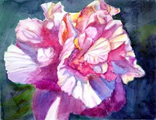
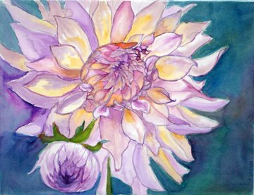
Here they are. The first is a white confederate rose. The second is a dahlia.
Any help would be appreciated.
Cia
Got Some New Books!Just a quick note to say that I'm going to take a little time to read my two new books. One is Penny Soto's book, and one is Nita Leland's new book. Names elude me at the moment. I'm pretty excited though!Cia
 Here's the one I just finished yesterday. This is 11" x 15" and it's a painting of a confederate rose blossom that I photographed in my yard. Without further ado, here it is:
 Oh happy day!!! I just sold a painting at the online gallery who represents me!
It's a 12" x 16" oil, and right now it's being shown at one of our local restaurants!
Will have to go and get it and ship it off! YAYYYYYYYYYYYYYYY!
This is the one!
Cecilia
 I think it's time to write some more. I'm still exploring florals in watercolor. I think I may be only beginning to get the hang of it.
Here I will post some of the recent ones. This is a quarter sheet of Arches 140 cp. I discovered a remarkable tool yesterday with this one. It's the lowly Q-tip, store brand. Really helps lift out those smaller light areas, and when it's got some paint on it, throw it away and get a new one!
With florals, it's all about luminosity I believe.
I've begun a new one today, and I think that my shadows look muddy, I will continue to work on it and hope I have not already ruined it!
Cia
 Hello all, I'm going to bore you with all this expounding on color that I'm about to do! There is a picture that I've done as a project for a watercolor group that I belong to. When I first did it, I hated it so much. It was not colorful, only having about 3 colors to it, and it was dead to me. I almost threw it out.
Then, last night, I got started on it, and it went where it wanted to go.
Now I find myself sort of defending it among my fellow groupies, but that's ok!
Here's what I wrote so far about this.
I had to work on this project a little more. I was way over there into it
tonight. Here's what I did. I took a little inspiration from Gina, and
from my daughter, who said, "Why are your backgrounds so dark?"
And my granddaughter who said "Why don't you ever put some colors back there?"
But more than that, it took on it's own look. I did not look at the photo again.
That's something I often do, when I get to a certain point, I put away the photo,
then let the painting be what it wants to be.
Here it is. I could have taken a better picture outside in the sun, but that was
not available to me tonight! I'm going to take another pic tomorrow if the sun shines.
(Then somebody wrote they thought it was overworked.) My reply:
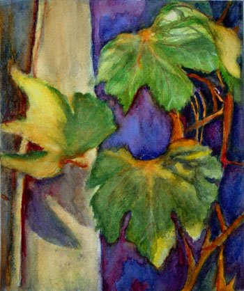
Artmaker wrote: Well, if you saw it in real life I think you would like it. This photo does nothing forit having been taken inside way after dark! Anyway, I felt very uneasy with it.But after I worked on it, I began to like it. The leaves came toward me, the bluereceded, I was able to make some highlights where the sun hits the leaves, (Although I'mstill not satisfied with that) and toned down the light value on that post, Cheryl said itwas a post because she has seen lots of grapevines and they put them there as asupport for the vines. I did that to make the highlights on the leaves show up better.There is actually some depth in this one, whereas the dark background (which washard to get rid of) was flat to me and dead. So that was my rationale,and now I like it very much! So there's no accounting for taste, right? I will try toget a picture outdoors so you can see the thing right.Ciaand more:p.s. I think that I have this wierd vision problem when it comes to my paintings,where I want to see something, and I have to get that out of it or I'm unhappy anduncomfortable. It's something about the relationship of colors. I love to seeviolet, blue and yellow and gold and green in a painting, for some reason, no paintingseems right without that. There was almost a monotone about the first version,and it was making me feel sick, does that make any sense to y'all? And there mustbe some touches of orange in there too. After I lifted out that awful dark backgroundand put in some cobalt and some permanent magenta and let it run together, I feltbetter, the stone on my heart began to lift. Then I began to approach my visual joy.I began to see that relationship that my heart longs for. I know, I know, I'm gettingwierd on y'all. So I'm sad that nobody likes it but me and my daughter. Cia In response to that person who didn't like the changes I wrote additionally, Oh I didn't! I knew in my heart and soul that it was my vision! I was a little bitdisappointed because you didn't see it too, but you know, to each his own vision!Ha Ha...There is more to my lengthy prose about this topic. I majored in music in college,I wanted to be a choir director. So I took two years of music theory, (forgot it allbut still retain the feelings) and you know how you feel when a chord is unresolved?Well, then when it resolves on the next chord, you feel satisfied, less uneasy, complete.That's how I define the way I feel when I get the right balance, the right harmony,etc. I don't really care about what other people think that much when it comes to that;now if somebody says, your composition is off, your drawing sucks, your values are notright, you don't have your light source clearly defined (and that is something I've been guilty of,as well as the other things) then I will take another look and go right in and try to do something about that. But whenit comes to colors, I have my vision, and it has to be there, or I'm very, very unhappy.Some people say something about the edges. Now I may need to think about that, becauseI don't see any problem with those, I'm not looking at that as much as I am color, and depth.I want the subject to come forward, the background to recede, and the values to be correct.Perhaps in some future lifetime I will worry about edges. LOLHowever, I still feel there is something else that this painting needs. I have to figure it out though,if I don't, then I will call this a lesson well learned, and leave it at that. At least I feel like Irescued this one out of the trash can! Ha Ha...Cia
 Hello again, I found out somebody has visited here and didn't even see my latest azaleas! So I'm putting them up right now! Finished these yesterday!
Cia
 I don't think this is finished, but here it is anyway. This is my first azalea ever!
Cia
My New DirectionHello, it's been awhile. I've come around to believe that I must stop regretting that I quit watercolor and find a new direction.I think I've done it! This is a watercolor of an iris that I did very loosely and I like it. I call this "Iris Lights II". (First one didn't turn out, and you ain't gonna see it!)
Cia
My Art ActivitiesHello, I'm back.
I am so happy, I sold that painting, "Stained Glass Pansies"! So it seems like maybe I've found some kind of niche. So I'm planning another one. I've looked at hundreds of floral pictures. I realize that it has to be a big, graphic look, with "pieces" that look like "puzzle" pieces. If that makes any sense.
Found several, and I'm about to start on one, it's to be called "Stained Glass Purple Iris"
and I think it qualifies, if I can only get it going. I realize that looking at the picture on my monitor is much better than looking at the photograph. So I plan on putting it on the screen, and I'm going to look at my computer screen as I paint instead of a photo.
Of course, as always, after I'm about half-way through, I will depart from the photo and
then begin to try to make it have the qualities I saw and that I'm attempting to depict.
Stay tuned!
Cia
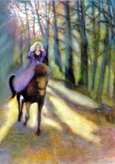 Early Morning RideI have not been doing much with this blog in a while! But somebody else's blog inspired me to work on this one.There is one new painting that I feel is worth putting in here... right now, I'm helping my granddaughter with a brand new (3 wks old) baby, and it's amazing how much time that can take.Here's the newest one. It's on Arches 140 lb cp paper, it's about 22" x 30", and it evolved.First the picture I had showed a bicycle rider where you see my maiden and horse. I took out the biker and put this in instead. I've never done a horse before either!


.JPG)


