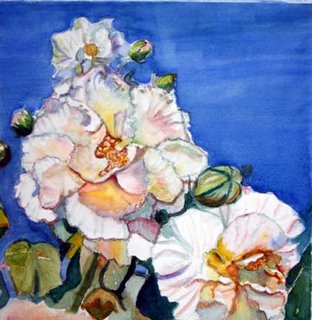
This is what I did yesterday and day before. It progressed from a wider picture. After Pauline Healey said the design wasn't good, I began to progressively tape off parts of the painting until I got to this place. I thought this was a good design. The main flower is not in the center and I left the space on the right for a resting space. Here I employed the method of laying down 3 primary colors on a wet petal to get an iridescent look. To do that, one wets the petal, waits for the shine to go away, then again, and then paint yellow first, beside that pink or cool red, and then blue beside that. This prevents the color from becoming green! The other thing that I remembered is that the under side of things reflects a warm light bounce from the ground. I think it worked to create a 3D effect, especially on the flower on the right. What is your opinion?
I know, I know, the sky wash is flawed, I'm trying to decide how to fix that.


.JPG)


2 comments:
Hello Cia,
A wonderful painting but then I say that of all your art work...because its the truth.
Joy in OZ
Glad I found your blog. Very nice work. I think your use of colors is great. Nice combinations.
Post a Comment